Previewing fonts is an essential step in typography and design, allowing for the evaluation of a typeface's suitability before its final implementation. It involves assessing visual characteristics, readability, and overall impact within a specific context.
Why Preview Fonts?
Effective font previewing ensures that the chosen typeface aligns with the project's goals and enhances user experience. Key reasons include:
- Visual Cohesion: To ascertain how well a font integrates with other design elements, imagery, and color palettes, contributing to a harmonious overall aesthetic.
- Readability and Legibility: To confirm that the font is clear, easy to read, and comfortable for the eyes at various sizes and in different environments (e.g., body text, headlines, captions).
- Tone and Emotion: To evaluate if the font's character and style effectively convey the intended mood, message, and brand personality.
- Technical Suitability: To check for necessary glyphs, language support, and how the font renders across different operating systems or browsers, if applicable.
- Contextual Appropriateness: To ensure the font choice is suitable for the target audience, the medium (print, web, mobile), and the specific application.
Methods for Previewing Fonts
Several tools and techniques can be employed for font previewing:
- Operating System Font Viewers: Most operating systems (like Windows Font Viewer or macOS Font Book) offer basic preview capabilities, allowing you to see a sample string in different sizes.
- Design Software: Applications such as Adobe Photoshop, Illustrator, InDesign, Figma, and Sketch provide robust font preview features. Users can type custom text, adjust size, weight, style, and see the font applied directly within their design mockups.
- Online Font Foundries and Services: Websites like Google Fonts and Adobe Fonts offer interactive preview tools. Users can input custom text, experiment with various weights and styles, and see how fonts render in paragraph or headline formats.
- Dedicated Font Management Software: Tools like FontBase, Suitcase Fusion, or RightFont offer advanced preview options, often allowing side-by-side comparisons, custom preview strings, and display of all glyphs within a font family.
- Web Browser Developer Tools: For web projects, browser developer tools (Inspect Element) allow designers and developers to temporarily change fonts on a live or local webpage to preview alternatives in a real-world context.
- Word Processors: Basic font previews can also be done in word processing software, though often with less control than dedicated design tools.
Key Aspects to Evaluate During Preview
When previewing fonts, pay attention to the following characteristics:
- Character Set and Glyphs: Ensure the font includes all necessary characters, symbols, ligatures, and diacritics for the intended language(s) and content.
- Weights and Styles: Examine the range of available weights (e.g., light, regular, bold, black) and styles (e.g., italic, oblique) to ensure versatility for different typographic hierarchies.
- Spacing: Observe the default kerning (space between specific character pairs), tracking (overall letter spacing), and leading (line spacing) to assess visual balance and readability.
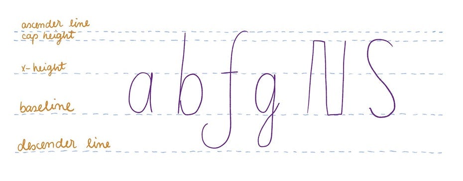
- X-Height: Note the height of lowercase letters relative to uppercase letters, as this significantly impacts perceived size and readability, especially in body text.
- Contrast: For display fonts, assess the contrast between thick and thin strokes. For text fonts, ensure sufficient clarity and evenness.
- Rendering at Various Sizes: Check how the font looks at both small text sizes (for legibility) and large display sizes (for detail and character). Pay attention to hinting for on-screen clarity.
- Numerals and Special Characters: Evaluate the design of numerals (oldstyle, lining, tabular) and special characters like ampersands or currency symbols if they are critical to the project.
Best Practices for Effective Font Previewing
- Use Real or Representative Text: While "Lorem Ipsum" can be a starting point, previewing with actual content or text that closely mimics the final content provides a more accurate assessment. Pangrams like "The quick brown fox jumps over the lazy dog" are useful for seeing all alphabetic characters.
- Test in Context: Preview the font within the actual design layout or a close mock-up, considering surrounding elements, colors, and spacing.
- Compare Multiple Options: View several font candidates side-by-side to make informed comparisons regarding their suitability.
- Check Different Backgrounds: Preview fonts on light, dark, and potentially textured backgrounds that might be used in the final design.
- Consider the Medium: A font that looks good in print may not render as well on screen, and vice-versa. Test accordingly.